| return |
|
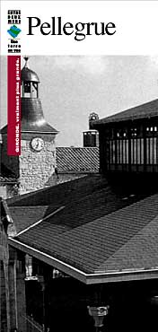
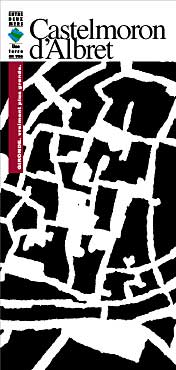
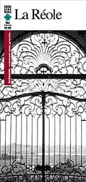
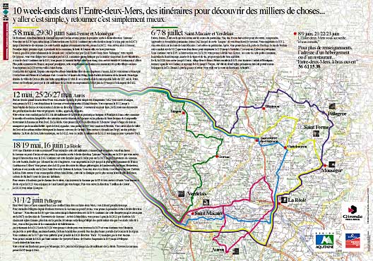
A region in the south west of France, the "Entre-deux-Mers" is, much like the rest of the country, composed of a multitude of villages and towns : each taking their own direction (or lack of) in communications. To solution this problem, a general visual identity approach was adopted to consolidate the image of the region and to simplify printing.
|
|
return |
|
|
|
The basic logo (or icon) regroups the existing identities of both the Entre-deux-Mers, a region in name only, and the Gironde, the actual namesake of the area.
To facilitate coherence and recognition, the covers of each document produced by the individual towns or villages followed the guidelines set in the identity chart. The photos are systematically reprduced in 4 color black and white, enhancing what can often be poor original document color.
|
|
|